10 Essential Tips for Building Accessible Rich Text Editors
Rich text editors are among the most complex UI components to make accessible. Unlike simple forms or buttons, they require careful consideration of keyboard navigation, screen reader announcements, and dynamic content updates.
Making your editor accessible isn’t just about compliance—it’s about ensuring that users with disabilities can create and edit content effectively. This directly impacts your product’s usability and your company’s legal compliance.
The following is a list of 10 essential recommendations for building accessible rich text editors. While most points apply to any framework, some examples are specific to React.js.
1. Test with an actual screen reader
If you’ve never used a screen reader, try one out on your app or any app with a rich text editor like Google Docs, Medium, or Notion. This hands-on experience will immediately show you why accessibility matters.
- On OSX you already have one built in to your operating system: VoiceOver.
- For Windows users there’s nvda (free) which is also the most widely used.
- Another popular screen reader is JAWS (not free).
All of the below recommendations become more obvious if you put yourself into your users shoes.
2. Avoid keyboard traps
Overriding default keyboard behavior to implement features such as hotkeys or indenting text via Tab is a common pattern in web-based rich-text editors and IDEs.
However, screen-reader users rely entirely on the keyboard to navigate your app, their browser, and operating system. It’s frustrating and hard to overcome when default keyboard functionality is prevented by an application.
Common keyboard trap scenarios:
- Preventing Tab from moving focus away from the editor
- Overriding Escape key behavior
- Blocking arrow keys from their default navigation
Best practices:
- Always allow Tab to move focus out of the editor
- Use Escape to close menus or return focus to the editor
- Test with actual screen readers to ensure navigation works as expected
If you’re implementing custom hotkeys, check they don’t collide with browser or operating system shortcuts.
3. All interactive elements must be reachable via tab and/or arrow keys
Most rich text editing applications make use of menus and toolbars, dynamically positioned or fixed in place.
To ensure that elements are reachable via keyboard they need to be focusable. DOM elements such as button, input, select or textarea are focusable by default. If you’re using an element that isn’t considered interactive (such as a div) you are required to add a tabindex and a role attribute so that the screen reader knows how to interact with the element.
Consider how much work it is for a keyboard-only user (the mouse is mostly useless for a user with sight-issues) to navigate to these UI elements. This will depend on the position of the element in the DOM and how many other interactive elements are in between.
If you’re building an editor with a floating toolbar (like Medium’s, which is completely inaccessible via Tab keys), pay close attention to how a keyboard-only user can navigate to and from these buttons and toolbar components.
Example: Accessible floating toolbar
const FloatingToolbar = ({ isVisible, onClose }) => {
  const toolbarRef = useRef(null);

  useEffect(() => {
    if (isVisible && toolbarRef.current) {
      // Focus the first button when toolbar appears
      toolbarRef.current.querySelector('button').focus();
    }
  }, [isVisible]);

  const handleKeyDown = (e) => {
    if (e.key === 'Escape') {
      onClose();
    }
  };

  return (
    <div
      ref={toolbarRef}
      role="toolbar"
      aria-label="Text formatting"
      onKeyDown={handleKeyDown}
      style={{ display: isVisible ? 'block' : 'none' }}
    >
      <button aria-label="Bold">B</button>
      <button aria-label="Italic">I</button>
      <button aria-label="Underline">U</button>
    </div>
  );
};
For complex use cases (submenus or button groups), consider programmatically moving focus. More info on managing focus inside groups.
4. Use alt text for your images and make them configurable
If you’re rendering images in your editor, you should use an alt attribute to represent what the image contains to a screen reader.
However, for user-submitted content, it’s too difficult to generate meaningful alt text automatically. That’s why you should make the alt attribute configurable by the user.
Example: Image upload with alt text input
const ImageUpload = ({ onImageAdd }) => {
const [altText, setAltText] = useState('');
const [showAltInput, setShowAltInput] = useState(false);
const handleImageUpload = (file) => {
const reader = new FileReader();
reader.onload = () => {
onImageAdd({
src: reader.result,
alt: altText || 'User uploaded image'
});
};
reader.readAsDataURL(file);
};
return (
<div>
<input
type="file"
accept="image/*"
onChange={(e) => {
handleImageUpload(e.target.files[0]);
setShowAltInput(true);
}}
/>
{showAltInput && (
<input
type="text"
placeholder="Describe this image for screen readers"
value={altText}
onChange={(e) => setAltText(e.target.value)}
aria-label="Alt text for image"
/>
)}
</div>
);
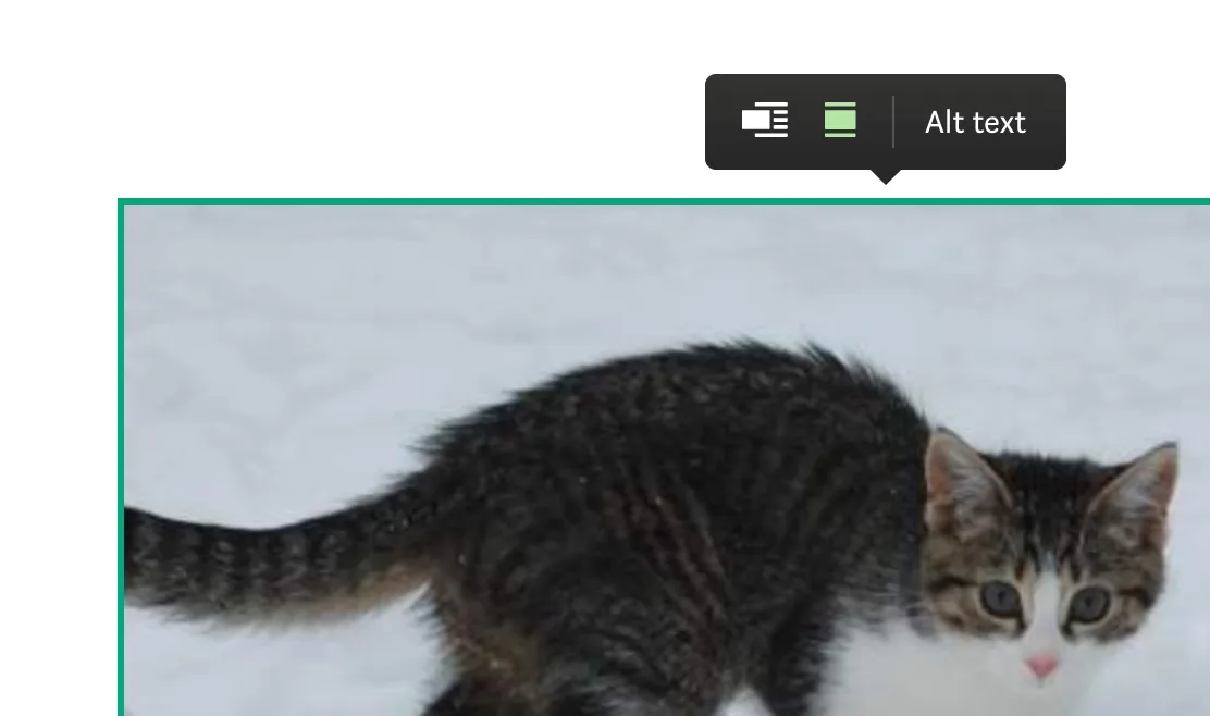
};Here’s what this looks like on Medium.com:
5. Label your icon buttons
Most rich text editors make use of common icons for text formatting and layout.
These icons don’t have textual meaning on their own, hence we need to tell the screen reader what they are by assigning the aria-label attribute like so:
<button aria-label="Bold" onClick={makeTextBold}>
  <MyIcon>
</button>
If you’re not using the semantic button element, you need to assign the tabindex attribute (to make it tabbable) as well as the button role (to tell the screen reader that this is a button), see below:
<span
  aria-label="Bold"
  role="button"
  tabindex="0"
  onClick={makeTextBold}
>
  <MyIcon>
</span>
6. Use a linter with a11y support
To make it easier to stay on top of your app’s accessibility, a linter can go a long way.
For React users:
- eslint-plugin-jsx-a11y - Catches missing ARIA attributes and accessibility issues
- @axe-core/react - Runtime accessibility testing
For other frameworks:
- axe-core - Works with any framework
- Lighthouse - Built into Chrome DevTools
Example ESLint configuration:
{
  "extends": ["plugin:jsx-a11y/recommended"],
  "rules": {
    "jsx-a11y/alt-text": "error",
    "jsx-a11y/aria-role": "error",
    "jsx-a11y/click-events-have-key-events": "error"
  }
}
I recommend running your linter automatically (either as part of your CI or with a git hook). This is especially valuable for teams.
7. Use an accessible component library
Using established component libraries will give you a leg-up on reaching a good accessibility baseline. These libraries have already solved many common accessibility challenges.
Recommended React libraries:
- Radix UI - Unstyled, accessible components (successor to Reach UI)
- Mantine - Full-featured with excellent accessibility
- Chakra UI - Simple, modular, and accessible
- Material-UI (MUI) - Google’s Material Design with accessibility features
For other frameworks:
- Vue: Headless UI, Quasar
- Angular: Angular Material, PrimeNG
- Svelte: Carbon Components Svelte
Note: Even with accessible libraries, you still need to test with real users and screen readers. Libraries provide a good foundation, but they can’t guarantee your specific implementation is accessible.
8. Think twice about whether you need collaborative editing
If your rich text editor has collaborative editing, the content of a user’s document can change while they’re editing it. The screen reader needs to be notified of these updates, but these notifications must not be too noisy or distracting—a difficult balancing act.
Accessibility challenges with real-time collaboration:
- Screen readers may announce every change, creating noise
- Focus can be disrupted when content changes
- Users may lose their place in the document
- Conflict resolution can be confusing for screen reader users
Potential solutions:
- Use ARIA live regions with
aria-live="polite"for non-urgent updates - Provide a summary of changes rather than announcing each edit
- Allow users to disable real-time updates
- Implement a “review changes” mode for screen reader users
A good reference is Google’s “Live Edit” accessibility features, which provides a list of edits made by other users.
My recommendation: Think twice about whether you actually need real-time collaboration before adding it to your roadmap. These features are notoriously expensive to implement, test, and maintain accessibly.
9. Use a title attribute for iframes
Embedding content via iframes is a staple for rich text editors these days. To make this accessible for screen readers, you should use the title attribute to describe what the iframe contains.
Example: Accessible iframe embedding
const EmbedComponent = ({ url, type }) => {
  const getTitle = (url, type) => {
    switch (type) {
      case 'youtube':
        return 'YouTube video embed';
      case 'twitter':
        return 'Twitter post embed';
      case 'codepen':
        return 'CodePen demo embed';
      default:
        return 'External content embed';
    }
  };

  return (
    <iframe
      src={url}
      title={getTitle(url, type)}
      width="100%"
      height="400"
      frameBorder="0"
      allowFullScreen
      aria-label={`Embedded content from ${type}`}
    />
  );
};
Best practices:
- Always provide a descriptive title
- Use
aria-labelfor additional context - Ensure the iframe content is keyboard accessible
- Consider providing a fallback link to the original content
10. Always use the textbox role
Any rich text editor using the contentEditable attribute (which is pretty much every rich text editor) needs to use the “textbox” role to tell the screen reader that it will respond to input and editing commands.
Example: Proper textbox role implementation
const RichTextEditor = () => {
  return (
    <div
      contentEditable
      role="textbox"
      aria-label="Rich text editor"
      aria-multiline="true"
      tabIndex={0}
      style={{ minHeight: '200px', border: '1px solid #ccc' }}
    >
      Start typing your content here...
    </div>
  );
};
Most modern frameworks (Draft.js, Slate.js, ProseMirror, Lexical) render this by default, but it’s always good to double-check!
Testing Checklist
Before launching your rich text editor, make sure you’ve tested:
- Screen reader testing - Test with VoiceOver, NVDA, or JAWS
- Keyboard navigation - Ensure all features work without a mouse
- Focus management - Check that focus moves logically through the interface
- ARIA labels - Verify all interactive elements have proper labels
- Color contrast - Ensure text meets WCAG AA standards (4.5:1 ratio)
- Alt text - All images have descriptive alternative text
- Error handling - Error messages are announced to screen readers
- Mobile accessibility - Test with mobile screen readers
Conclusion
Building accessible rich text editors is challenging but essential. These 10 tips provide a solid foundation, but remember that accessibility is an ongoing process. Regular testing with real users and screen readers is the best way to ensure your editor works for everyone.
Start with the basics—proper ARIA labels, keyboard navigation, and screen reader testing—then gradually implement more advanced features. Your users with disabilities will thank you, and you’ll create a better product for everyone.
Resources for further learning: